Up Up and Away
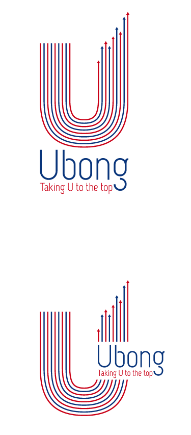
I really like this logo, well, I really like this graphic but of course I'm not here to talk about that amazing graphic. I'm here to talk about the font. At a glance this sanserif font doesn't do that graphic justice, but the more I look at it the more it grows on it. It has an almost foreign look to it, but maybe that's just me. The font style reminds me of something a little bit Russian. But despite that, the font seems to be lifting up and away from the baseline, which suits the idea of the logo. I really like the way the g is separated from itself and this is probably one of my favorite designs among all of the things I've seen in the past few months.
No comments:
Post a Comment