Saturday, November 16, 2013

PLUS .com


PLUS .com

  
I like the idea of this, I really do.The color scheme's nice, I'd complain about the feather pen but the ink wouldn't read as ink without it. I even like the color scheme which is very popular among fuelmybrand. I like the educated looking font choice, it reminds me of a tutoring system a lot. the only real problem I have with this is the placement of .com. It feels like an afterthought, especially not being the same color as the line it's replacing. It doesn't really belong anywhere either, and thus the general hierarchy of the the logo is broken with just one bad placement. It's really not a bad logo, I like it for what it is, I just can't get over that .com placement.

Friday, November 15, 2013

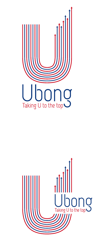
Up Up and Away


Up Up and Away

  
I really like this logo, well, I really like this graphic but of course I'm not here to talk about that amazing graphic. I'm here to talk about the font. At a glance this sanserif font doesn't do that graphic justice, but the more I look at it the more it grows on it. It has an almost foreign look to it, but maybe that's just me. The font style reminds me of something a little bit Russian. But despite that, the font seems to be lifting up and away from the baseline, which suits the idea of the logo. I really like the way the g is separated from itself and this is probably one of my favorite designs among all of the things I've seen in the past few months.

Thursday, November 14, 2013

CHRONICLE


CHRONICLE

  
I absolutely adore the typography of this logo. I really wish the green feather off of the 'h' in 'the' didn't exist, it just doesn't need a graphic element it's strong enough the way it is. The way the tagline and 'Chronicle' are the same color makes the hierarchy beautiful to me, it really does look like you've just highlighted part of a sentence in your own personal letter. The font choices are beautiful, I adore that they really ran with the script font while still keeping to a strong serif font for the rest of it. I really like this logo for what it is, it serves it's purpose wonderfully.

Wednesday, November 13, 2013

Education Radio Shack


Education Radio Shack 


A website design done again by Tokyo pistol, I do really like the basic design of this. It's easy to follow, and the layout is effective. The typography is all very readable, though I cannot personally read it. The top more important fonts look a little bit on the blocky end, and though I don't really have a point of reference the style reminds me of the sort of fonts that are used when teaching children how to read and write though not necessarily in a childlike way, they look very professional and yet are readable and relate-able. The rest of the typography is done in a thinner yet very standard looking style font, and it works. One other thing I'm a real fan of about this piece is the color scheme; it's not overly complex and yet it's effective. That professional blue with some eye catching accent colors works very well, and all of the important font follows the standard blue on the page. One thing I have to point out is the "Education UK" logo in the top right; while I have no problem with the font choices here and I actually like Education and the tagline below, the UK bothers me for multiple reasons. The color first of all hurts my eyes against the dark blue, and even if it were on white it just reminds me of the radio shack logo and I have a hard time getting the result that was intended for it. Other than that one issue however, I do really like this layout. It just needs a little bit more attention to the logo.

On that subject and because it's right there I just want to say that I don't like the typography in the RadioShack logo what-so-ever. The R in the circle is very serify and it just doesn't look like an electronics logo at all to me. The black typography isn't bad, I like the tracking and lack of a space between the two words I just feel that for this sort of a store there is a lot more than could have been done with the logo.

Monday, November 11, 2013

Bella Berries


Bella Berries

  
Bella bands, a fashion store of some sort. I really like this, the B becoming a butterfly but there being no other real graphic element works wonderfully, as do the font choice and the color scheme. The only real negatives I have to say about this piece would be that it reminds me a lot of the recent spring of frozen yogurt shops all over everywhere, from the font choice to the color scheme to the beautiful graphic. It pulls off exactly what it was intended to, but unfortunately it follows a signature style of a more popular market.

Sunday, November 10, 2013

Little Much


Little Much

  
Green apple delight; beautiful use of typography, a very discrete graphic r, and a very straightforward but well done color scheme. On it's own the spacing might look a little odd, so adding a green apple outline. Made it a little bit too big? Just put some delicious apple cider in there. Too much room below delight? Oh, add a tagline. Doesn't look complete? Oranges have a lot to do with green apples and apple cider- right? My point here is that a lot of what's been done looks like an after thought, the original concept is incredibly well executed however most of the rest of the logo doesn't look very thought into. The typographic elements are beautiful here, it's the graphics that are lacking. Or, in this case, are a little too much. Really? An orange slice? Really? 

Soft Impact


Soft Impact

  
Another piece that I cannot read from Tokyo Pistol, this particular piece is from a few works they did for some kind of transit. I really like the overall color scheme and layout, the use of subtle patterns and textures really adds depth to the overall piece. The typography in this piece is also very well chosen to me, the more headline looking parts have a brush look to me, a very inviting style that might make someone more inclined to take a trip. The font used in the body copy is very standard looking, readable and a little boring but it gets the point across. The numbers are fairly playful, but in a put together manner if that makes any sense; they have varying thicknesses while still being readable and looking formal. Overall I do really like this piece, though the graphic elements are a lot nice than the typography I still like the typographic elements.

Chocolate Tea?!


Chocolate tea?!

  
Just starting off, I don't mind this logo but there is one thing I really dislike about it right off the back; the font choice. It's not bad for this, has a slightly script looking aesthetic, could be organic and it honestly does work. I just personally don't care for it I wish they'd gone with something with a little more flow to it. I really like the simple leaf graphic, and the white outline behind the font. I do like the logo overall, I just don't care much for the vaguely script looking font, I just feel that the piece could have been overall more impacting if they had either committed to the script style or gone with something a little bit different.

Friday, November 8, 2013

Double Wheat


Double Wheat

  
I really like when graphics are in-cooperated directly into fonts, and this is a lovely example of that. The actual font choice of intelligent sort of bores me, it's very plain sanserif looking and doesn't have many points of interest minus the beautiful double L wheat graphics. Formulas seems to be done in a different font, though it might just be a none bold alternative that better shows off the combination of curves and sharp points within the typeface. The color scheme itself is brilliant, and while I don't believe the tagline is necessary it's well executed.

Thursday, November 7, 2013

Relax Cloud


Relax Cloud

  
Another logo from fuelmybrand, and another logo I really like. The font itself has a rounded off comforting feel, added to by it's color palette. I really like the little serif (at least it reminds me of a serif) off of the l, even though overall it's a sanserif font. The little details make the logo very inviting looking, something I would notice in a crowd of heavier brighter logos.

Technical Professional


Technical Professional

  
This is another logo that I really enjoy the graphic for, but I also really like the Typography. The bolded Techs brings emphasis to the service without taking away from the overall logo, the color scheme is professional but not intimidatingly so. There are no harsh black tones, or blinding bright colors; simply an inviting orange and a calm brown. The font is very technical looking, but doesn't bore me to look at like many other technical fonts have done before and the tagline doesn't really help nor hurt the overall affect. It's a very effective design, though I do like both the typographic element and the graphic I don't think they mesh that well together.

Tuesday, November 5, 2013

Spoon Test Tube


Spoon Test Tube


While I absolutely adore this logo's graphic element, I also really enjoy the typographic choices done here. Keeping all of the type on one line with no space between any of the words in a decision that works very well here, it evens out the weight of the graphic while still making the typography prominent. The actual font choice is a serif font, not too thick but still enough to catch my attention. The bold style contrasts the less important 'labs' word and brings my attention to what's more important. I really enjoy the typography, and while at a glance I liked the graphic as well, I can't say I like it's execution nearly as much taking a closer look at it.

Flower Sho--- Dentist


Flower Sho--- Dentist


I actually like this logo, I like the thick font with it not being overly script looking but still having the affect intended with the rose taking the place of the O. I don't even mind the pink font below, and I like the color scheme. What problem do I have with this logo? It doesn't even remotely remind me of a dentists office, family or not. It looks like a flowershop, and for a flower shop it's gorgeous. But for a dentists office, it leaves me desiring more. 

Plug in


Plug In

  
I just want to start off by saying that I adore this logo. The subtle wire concept, the font choice is gorgeous and fits the theme incredibly well. The word cable underneath is a very well picked font, in a color that matches and adds a bit of softness to the overall logo. There are some slight readability problems, and I have very mixed feelings on the gradient style in the back of Vandoos, however I still really enjoy this logo. 

Sunday, November 3, 2013

Room Room


Room Room

  
I prefer posting about pieces that I find inspiring, but I really just had to say something about this typographic fail win. Having looked at this on multiple occasions I'm just now seeing that the red letters create the word "Groom.". The readability on this is really just terrible. Having to look at it multiple times and getting different results each time from 'G the room room" "Groom the oom" "The Groom oom" and more. I must say, despite the disaster I spoke of before I like the color scheme of this logo as well as the added paw print bonus in the o's. 

Wednesday, October 30, 2013

Blue and White


Blue and White

  
From what I can gather out of a google translated description this is for a book of some sort, also from Tokyo Pistol, I would assume the cover but I'm not entirely sure. The inability to identify the actual work doesn't change my ability to get a feeling of the book from the typography, one of the first things I really appreciate is the use of white space in the top, while some of the bits seem a little bit busy they're all well utilized. The actual font choice is a bit thicker, not sharp or too square looking but still professional looking. Not intimidating though, it looks informative and professional without being too in my face about the information it has. I really enjoy the color scheme as well, the contrast of white and royal blue with the subtle lighter blue for some slightly less important information.

Monkey Fish the Book


Monkey Fish the Book

  
So that design firm I mentioned before is called Tokyo Pistol and this is a book cover design from them. I won't lie, I picked this one because of it's very intense typographic elements but originally I thought it was for a zoo or some kind of circus. It's not, but I still like the typography in this piece and I could see it on the cover of a book. I do not like the graphic elements however, but luckily I'm not here to talk about those. What I assume is the title of the book does exactly what I title should do; it catches me attention without being too intimidating, it looks very intense and important and adds to the hierarchy of the work. The pure white and black fonts do what they should, they're exciting looking, not perfect but don't grab my attention as much as the title does. The only thing I really have an issue with is the red font. Both the red on white and the red on black; the red on black looks okay at best on the gray white, and then gets lost and hurts my eyes to look at on the orange. The red on white just doesn't work at all for me, it looks transparent and event though I can't read it just looking at it strains my eyes. The more I look at this piece the less I have to admit I like it, but if I were just looking for a book it would surely catch my attention.

Monday, October 28, 2013

Price Tag


Price Tag

  
Again from fuelmybrand, though I do have a few Japanese ads I plan on posting about from another design firm at a later date, a very simplistic logo. The way the font on the tag looks very sharp and in your face, which defiantly works well for a shopping site. It's sharp, but it's not too sharp to be intimidating. It still looks fun, and has an Asian feel to it while still being in familiar lettering. The fonts above and below are a little more sophisticated looking, without being intimidatingly so. They're not too thin or small or sharp to be unrelated to the above font, and the only real graphic element only exists to emphasis the typographic elements. This is a piece I don't have very many problems with, aside from the slightly awkward swirl looking string off of the side of the tag. 

Butterfly Cards


Butterfly Cards

  
I've grown very interested in fuelmybrands designs, so here's yet another one from them. The only real problem I have with this particular logo is the color scheme, it reminds me a lot of a gas station. And that's probably a combination of the chicken like color scheme and the font choice, but regardless I do actually like the font choice. Though it took me a moment to read it has a very personal yet professional feel to it, the top M looking vaguely like a present, while the M and W together remind me of a butterfly. The borderline script font is very inviting and has a personal feel to it, without being overly unprofessional. I think overall it's very successful.

Sunday, October 27, 2013

ouo


ouo

  
I've grown really attached to fuelmybrand's logo work, and I enjoy this one especially. I really like the color scheme here, it's very inviting without looking overly modern; it looks like something that people could relate to. The font itself reminds me of something sort of tavern looking, but somehow when put together with it's color scheme it doesn't look that way. It looks more like something out of a story book, or something a little more Irish. Overally I really adore this piece, from it's playful font choice all the way to the subtle little face in the double o's I didn't notice before.